


Visualizer: An extraordinary view embedded in P6
by Firat Tekil
![]() | In Blog - EN|
| In Blog - EN|
Introduction
We are all familiar with the old-fashioned but convenient way of presenting our activities in Primavera P6: Gantt charts. Options for shapes of bars, lines and milestones are limited. That is why eventually you can easily run out of options while presenting your activities. It even started to engrave its own visualising norms: bars are blue on left side of the data date and green on right side of the data date. It is time to add some richness to our Gantt chart elements.
Visualizer at a glance
Visualizer is a reporting tool comes with a P6 license and you don’t have to pay an extra licence to be able to use it. Yet, it is not used a lot because people don’t know it. This unknown tool can perform 3 main jobs within its capabilities:
- Create TSLD’s (Time-Scaled Logic Diagrams);
- Gantt charts; and
- Compare schedules.
It is still a developing tool and has some drawbacks but let’s give its possibilities a look anyway. We will be focusing on the TSLDs and the Gantt charts in this post. The Visualizer tool can be found under “Tools” tab of Primavera. Although we might need to do some preparatory works before going ahead and opening it (see next paragraph).
Preparing for Your Visualizer Experience
Visualizer is a tool to present data extracted from a desired schedule. Hence it is important for you to first filter this data wisely to be able to structure your bars in Visualizer. Start your journey with adding user defined fields and/or activity codes for your activities. These codes and fields should enable you to group, sort and differentiate one activity to another in the tool. In figure 1 you can see an example on filtering important activities.
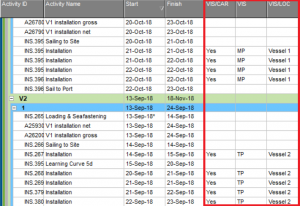
Fig. 01 – Special user defined fields and activity codes that will help us in Visualizer
When you are done with tagging activities with user defines fields and activity codes, it is time to launch Visualizer. When you launch Visualizer, you will have to decide which tool you are going to use: Gantt chart or TSLD. It is important to choose a suitable one because their way of working is significantly different. The work you will perform to structure a Gantt view cannot be transferred to TSLD view or vice versa.
Gantt View
Gantt view is your first option to present your activities with Visualizer. What you can expect from the Gantt view is essentially the same as Primavera P6’s Gantt chart view: the activity table is on the left side, the Gantt chart is found on the right side. You can find more visualisation options for both Gantt and activity table than in the standard P6 tool. For example, in Figure 2 you can see that lines are presented by colour coding to be able to locate each task easily on the Gantt chart (continuous horizontal purple and white lines).
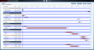
Fig. 02 – Gantt chart view example
TSLD View
With Gantt chart view, the total line of activities can make our printout vertically too large. Time-Scaled Logic Diagrams allow us to represent multiple activities on one row, hence the visualization is packed. You should see it as a combination between activity networks and Gantt charts. In Figure 3 you can see that different activities are grouped as preferred and different work groups are colour coded much more vibrantly compared to P6. In this example, every pattern represents a subcontractor.
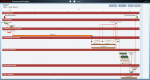
Fig. 03 – TSLD view example
But what is the difference with P6?
Having Visualizer in our pocket comes with significant visualizing benefits with respect to P6. We can see some of them below in Figure 4.
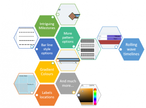
Fig. 04 – Some of Visualizer benefits to be discovered
Thanks to Visualizer, we can focus on different float paths, concentrate on an important time section of a project with rolling wave timelines, show a scenario analysis more vivid and highlighted or we can visualise the most important milestones of our project by making it bigger than any other element in a Gantt chart.
Conclusion
Working with complex schedules that have more than 5000 activities does not make our job easy to present it in the best and simplest way. Obviously, we will not be able to use Visualizer for showing all 5000 activities at the same time, but this tool has great capabilities waiting down there in Primavera P6 to summarize information with a better visualization.
What do you think about Visualizer? Do you use Visualizer? Let us know in the comments below.
